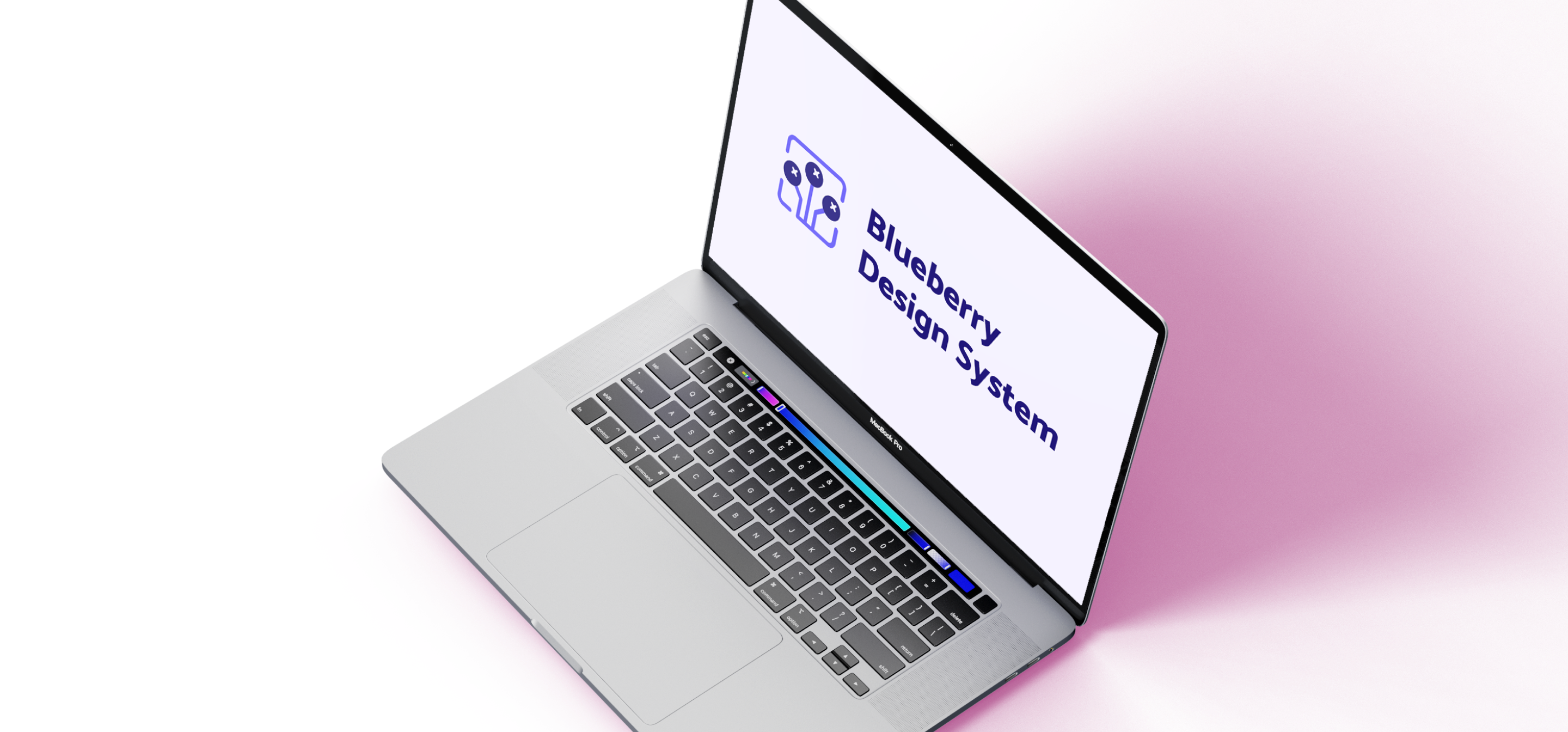
Blueberry Design System
Improving the designer's work and the front-end's development
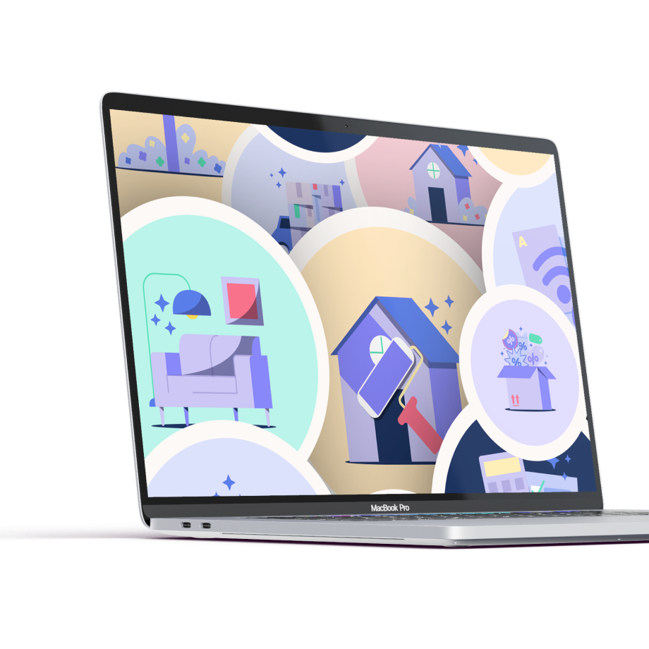
iq is a lot of things — an automatic credit card payment service for utility bills (energy, gas, telephone, internet, etc), but also a Credit Card Marketplace. iq is growing so fast and we needed ways to expand healthily. The Front-End team felt that their code needed to be more organized. The Design Team faced a problem creating new components every time and some screens had different components from each other. So I saw an opportunity to develop a Design System.

My Role
Being the lead for kick-starting our Design System I was responsible for:
- Facilitate ideations to define our Design Principles and our Design System name;
- Build an Interface Inventory, in order to scan for inconsistencies in our web app and websites;
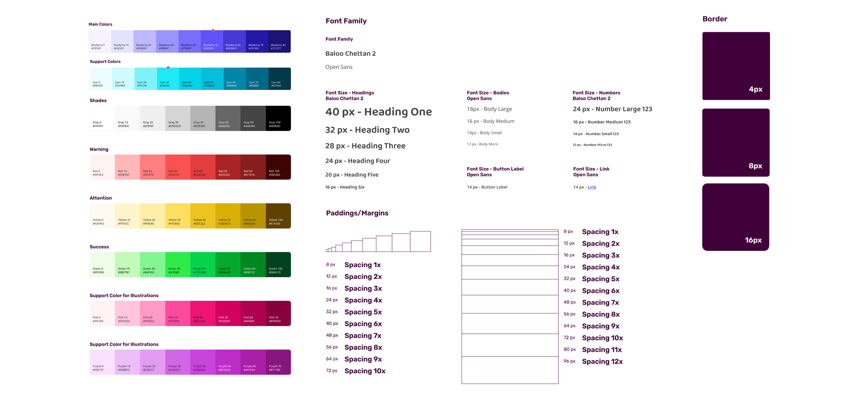
- Build the Design Tokens: define and organize the colors, typography, grids and spacings;
- Start the main Components, predefined by our team, to apply in our first project.
Learnings
Building a Design System is a non-linear process. Sometimes it was difficult to know if we were building the right thing, but it was satisfactory to see it being applied and things starting to connect and make sense. Both the Front-End team and the Design team noticed:
- Time saved with Components and Design Tokens ready to use;
- More time to focus on the experience in general;
- Less time fixing bugs and coding;
- Greater proximity between the Design and Front-end teams;
- Knowledge acquired during the process.
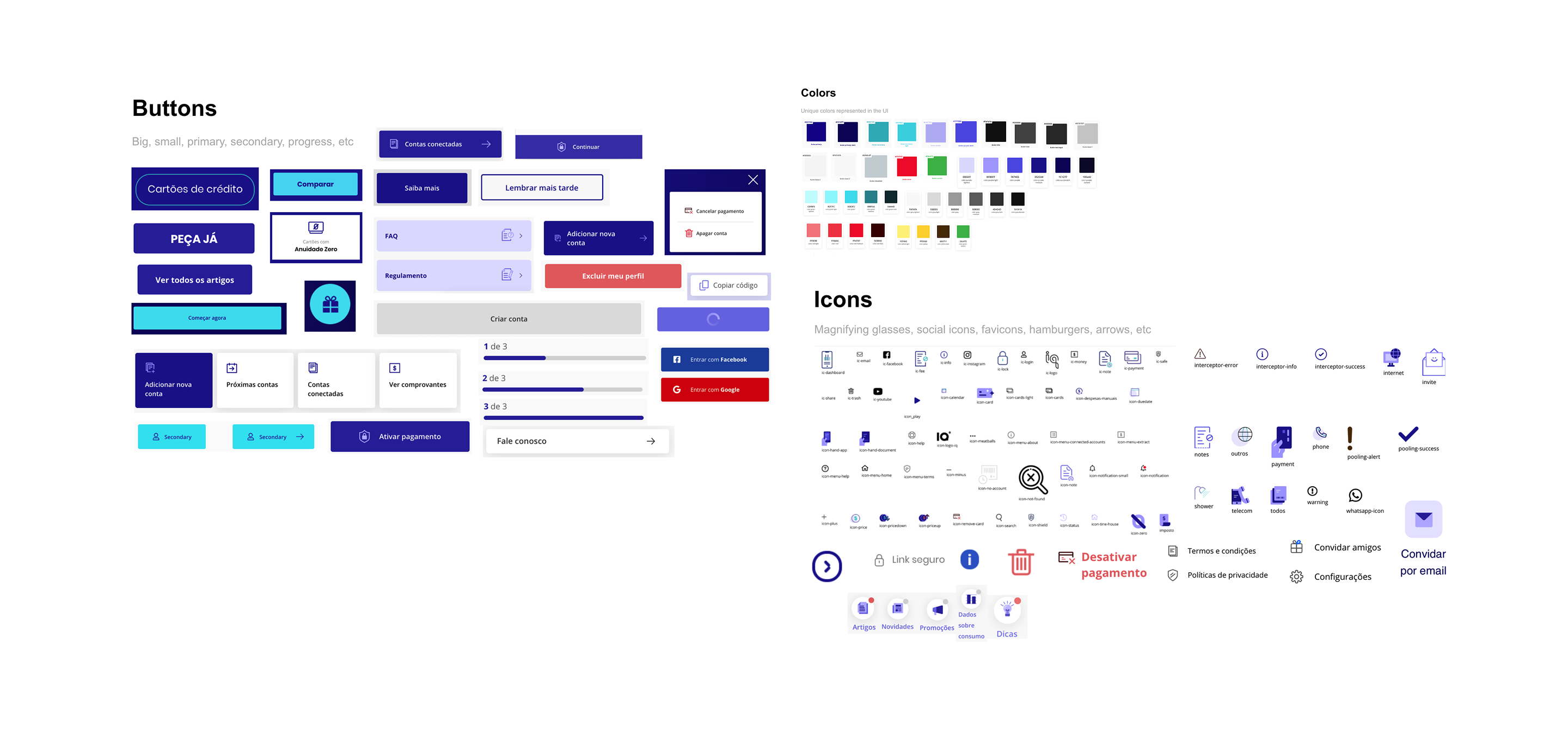
The experience before
Below you can see some discrepancies in our components and tokens, like in Buttons, Icons and Colors — different styles, different icons applied in components and a lot of color variants with no standard.
After the new Design System
The first thing we did was to “fix” our issues with our current Design Tokens: a legacy of different shades of colors, non-standard typography, a ton of different and non-standard icons and a lack of grid and spacing determination.
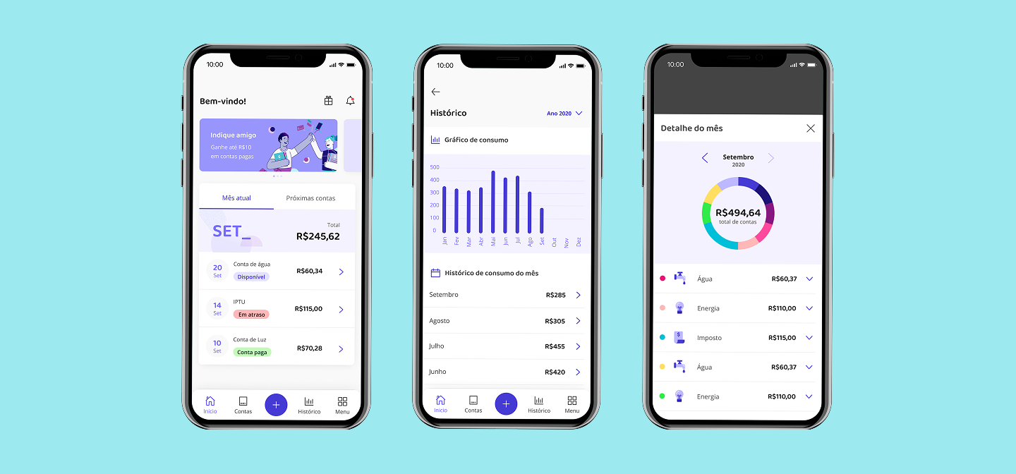
Design components
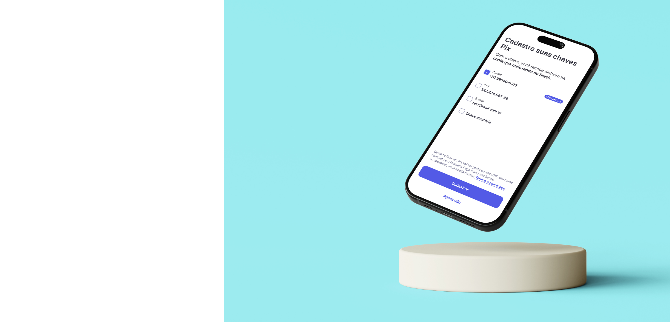
After designing the Design Tokens, we finally started to create the Components section: a series of standalone UI elements designed to be reusable, like a button. The components helped us to create the new section of our iq app, called New Architecture.
Next steps
- Keep building and improving our Design Tokens and Components;
- Measure impact quantitatively to inform our stakeholders of the gains of the Design System;
- Build the library in the ZeroHeight platform, so the rules can be easily disseminated.
Mercado Pago restyling

Don't be shy, say hi!
You can contact me through e-mail or my social media below: